Malavika
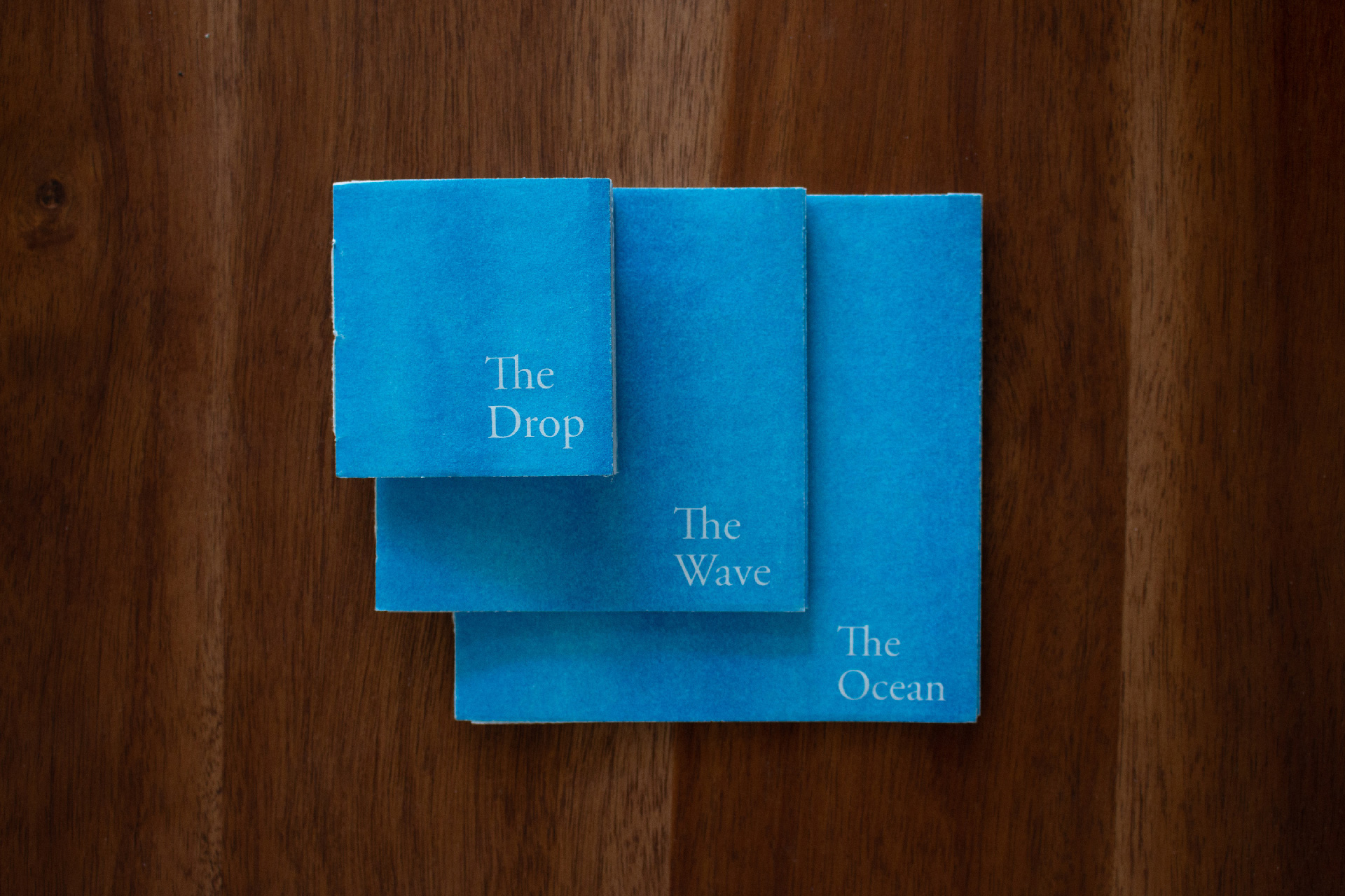
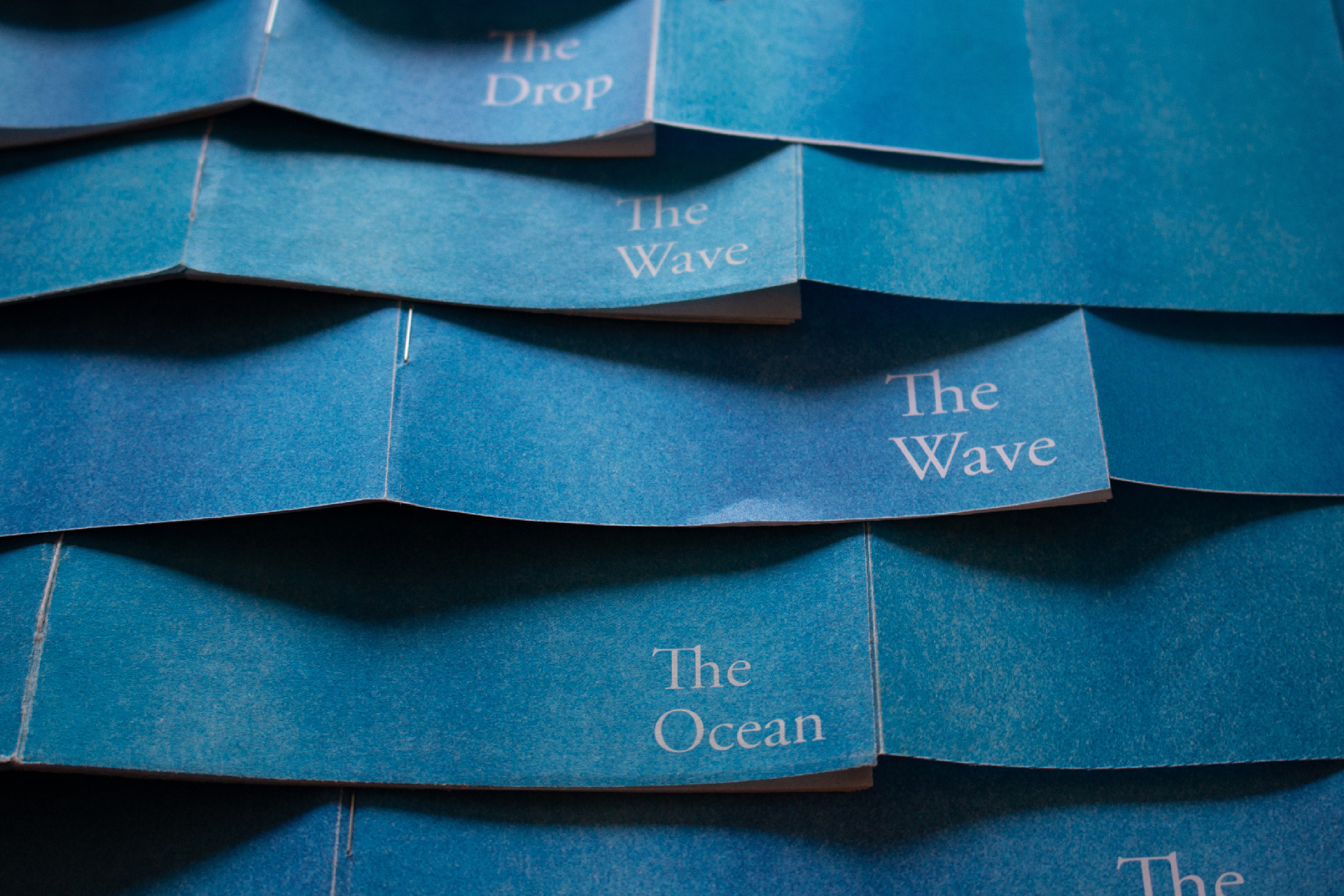
The Drop, The Wave and The Ocean
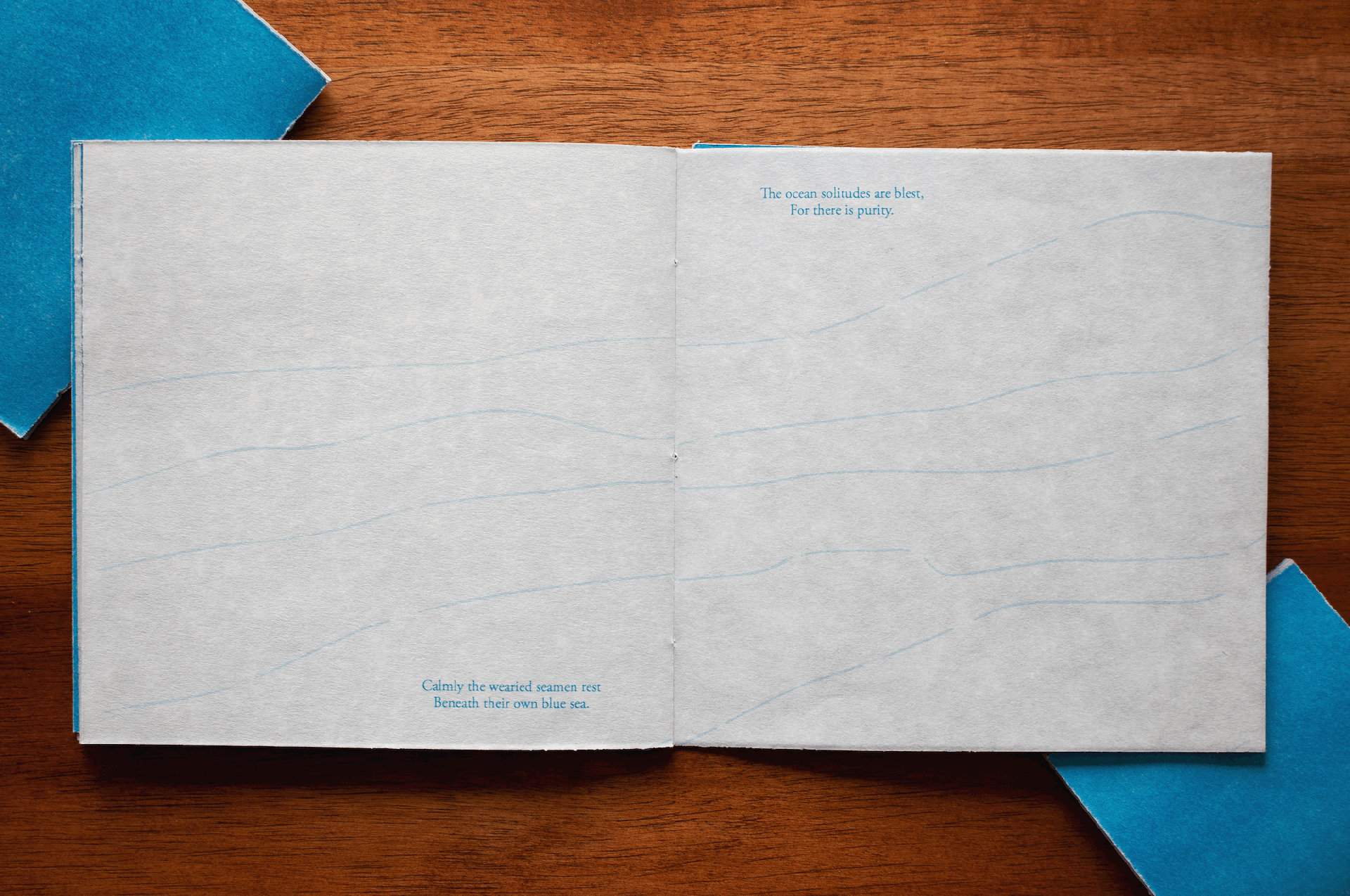
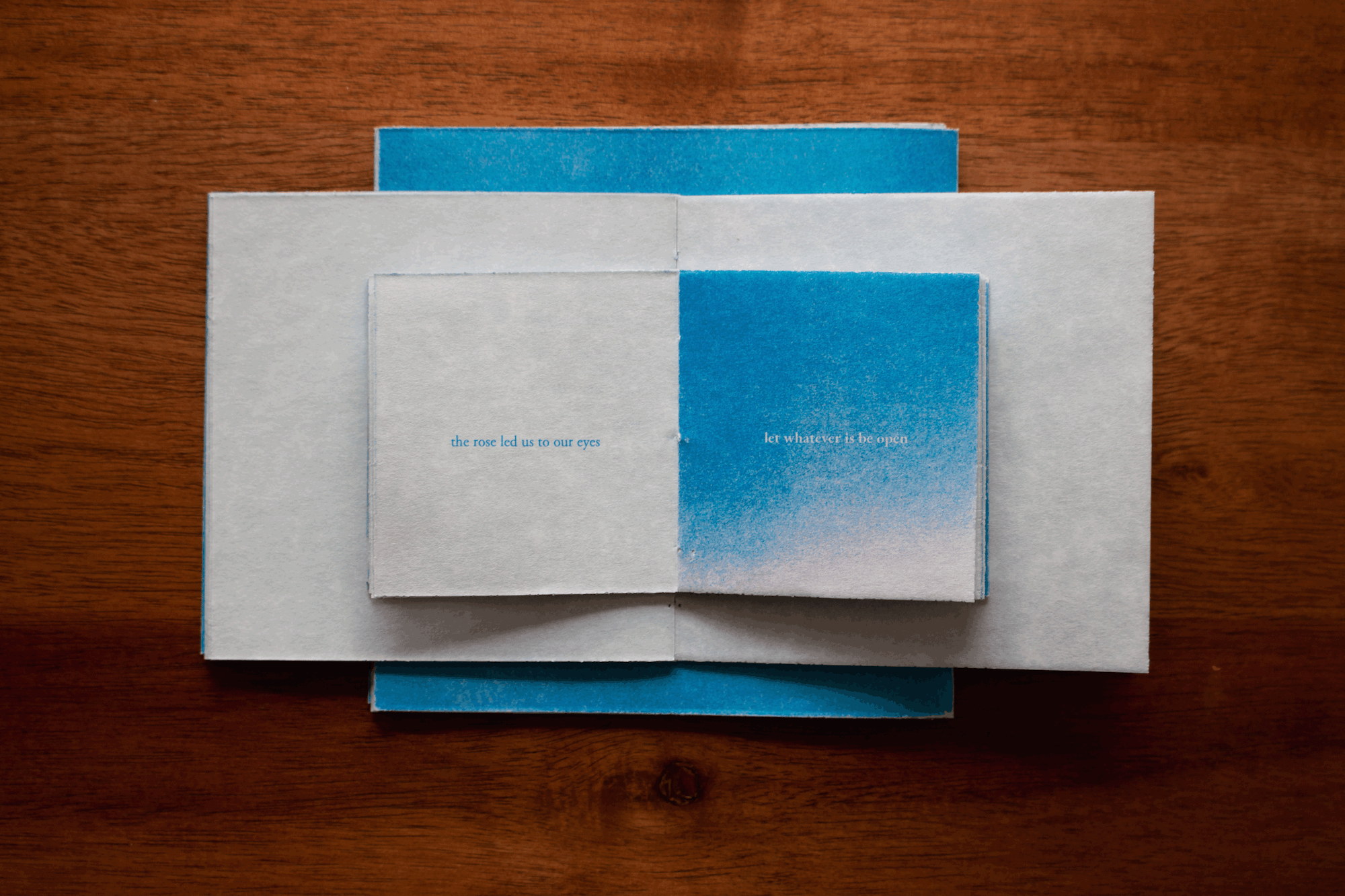
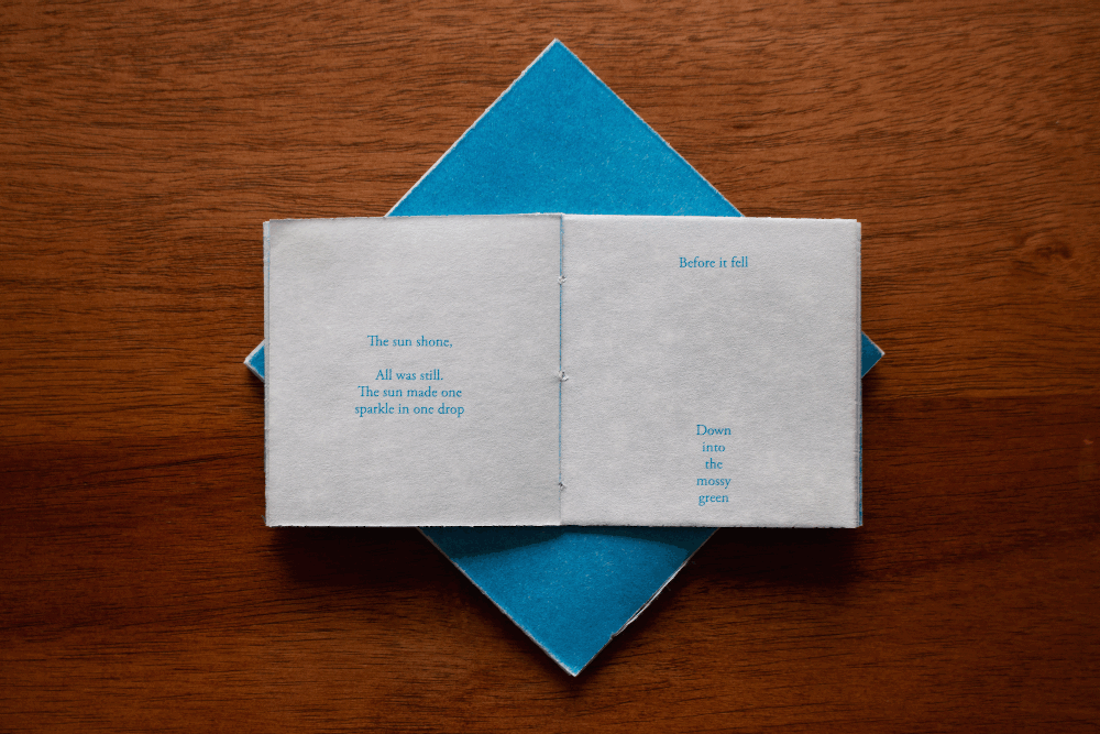
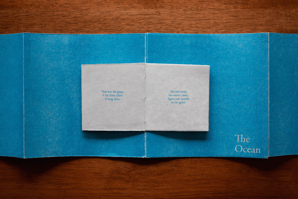
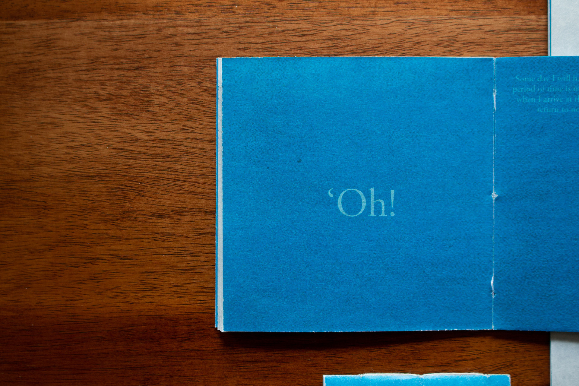
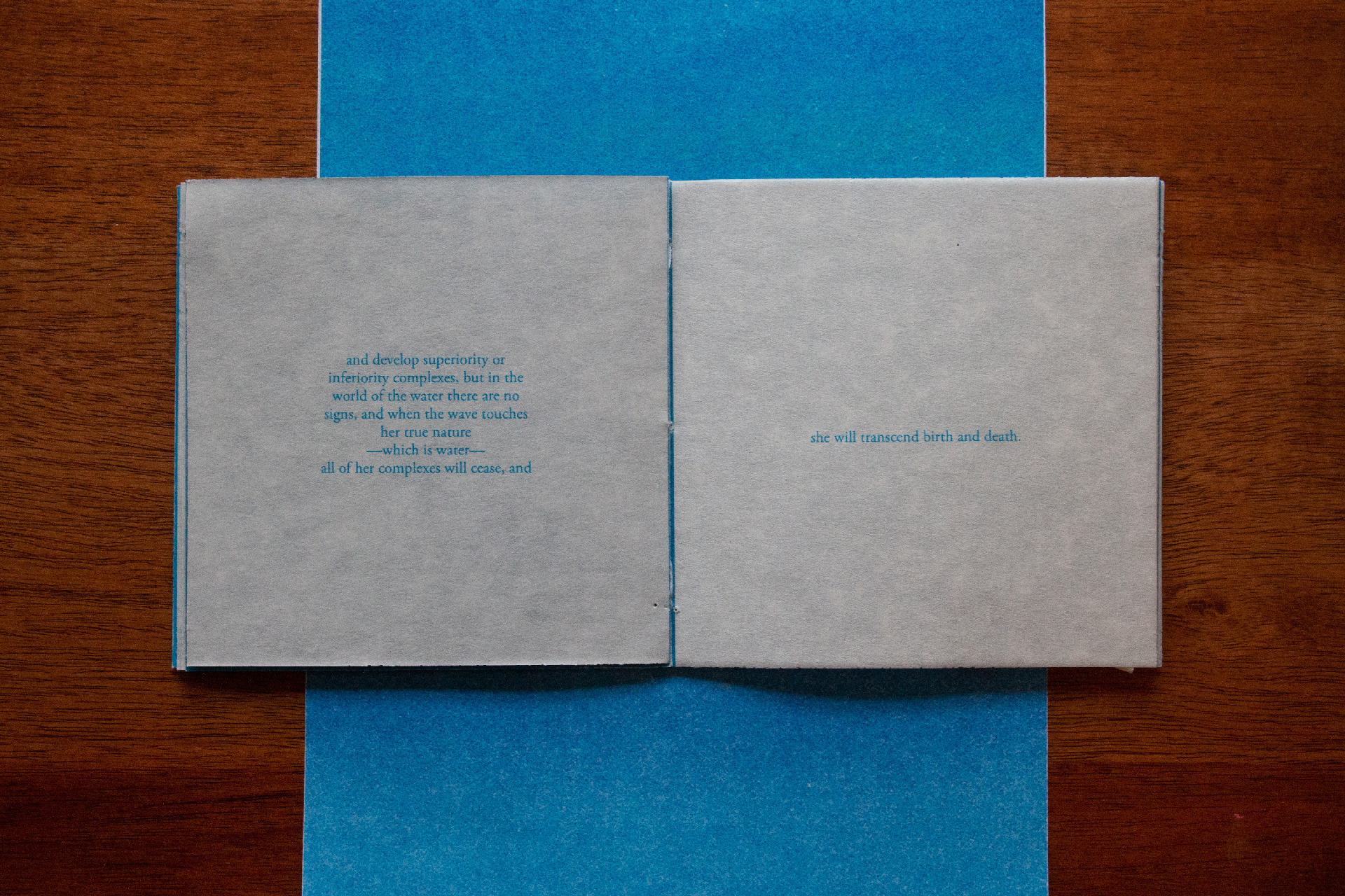
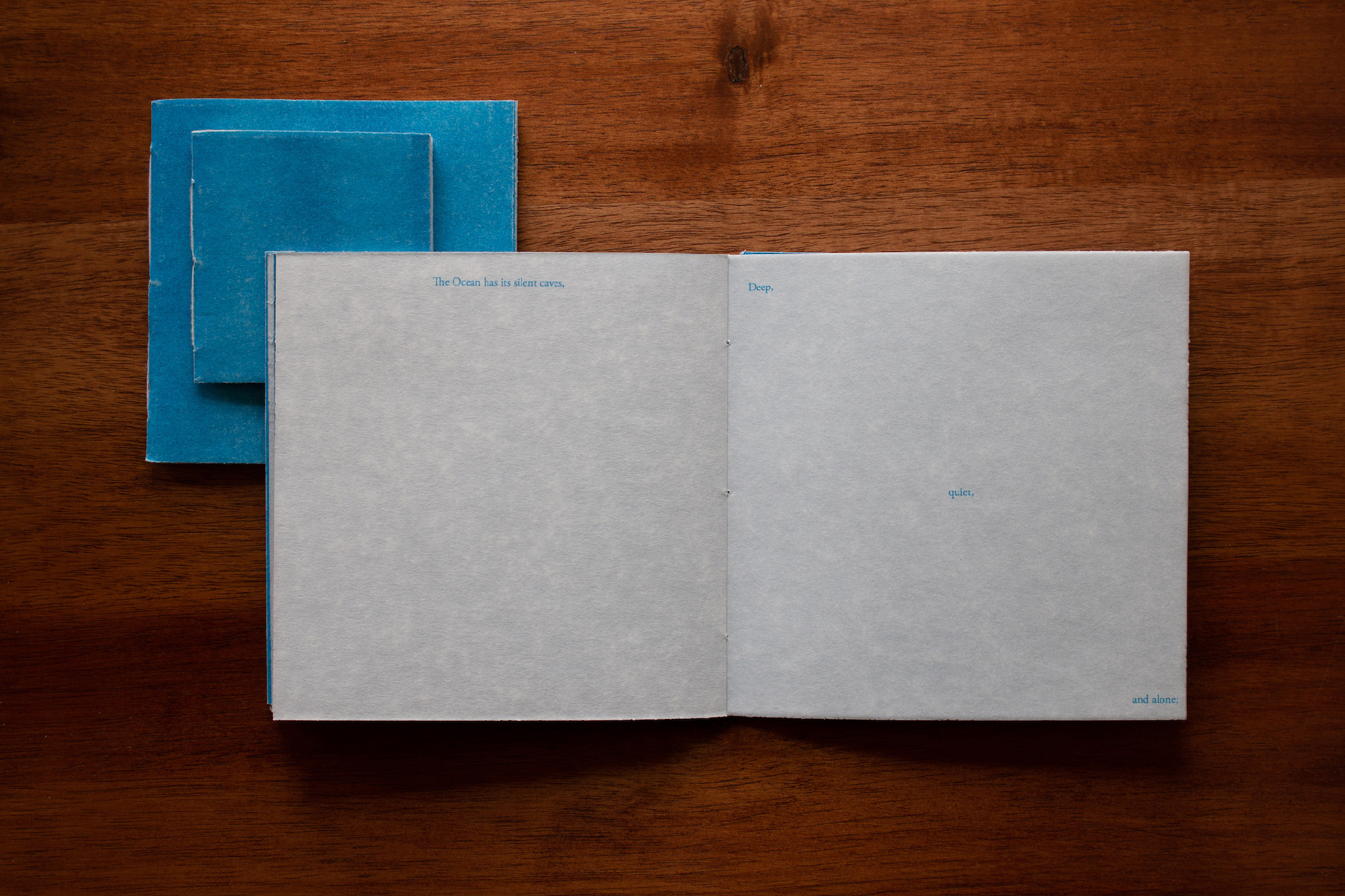
The type is laid out in a fluid manner, occasionally taking the form of the words it's bringing to life and sometimes receding into the background as if sinking into the book itself. The cherry on the cake was using parchment paper to print the booklets on –– the texture of the paper resembled soft light reflecting on a body of water, and tied the entire piece together.
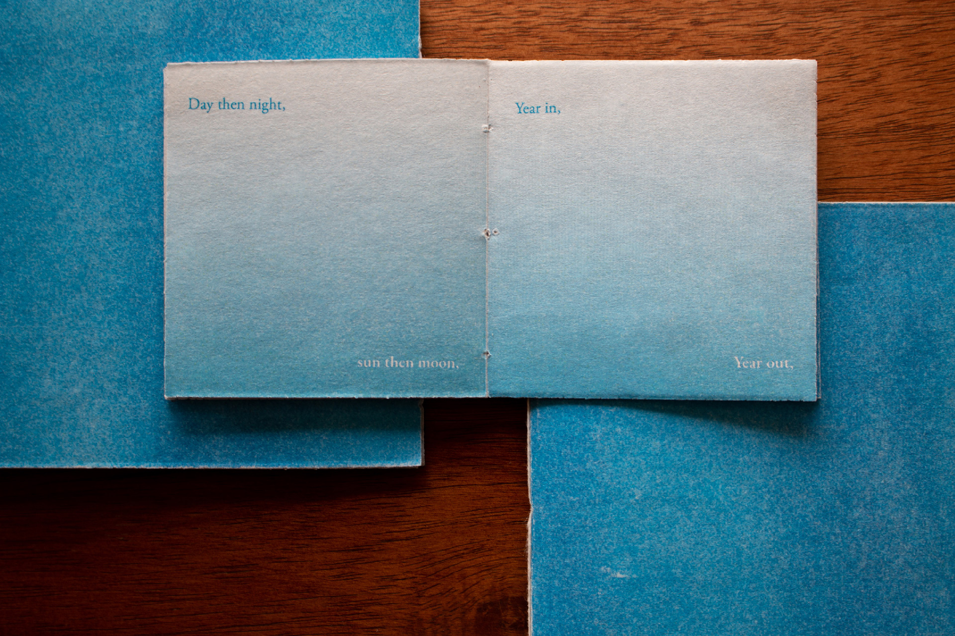
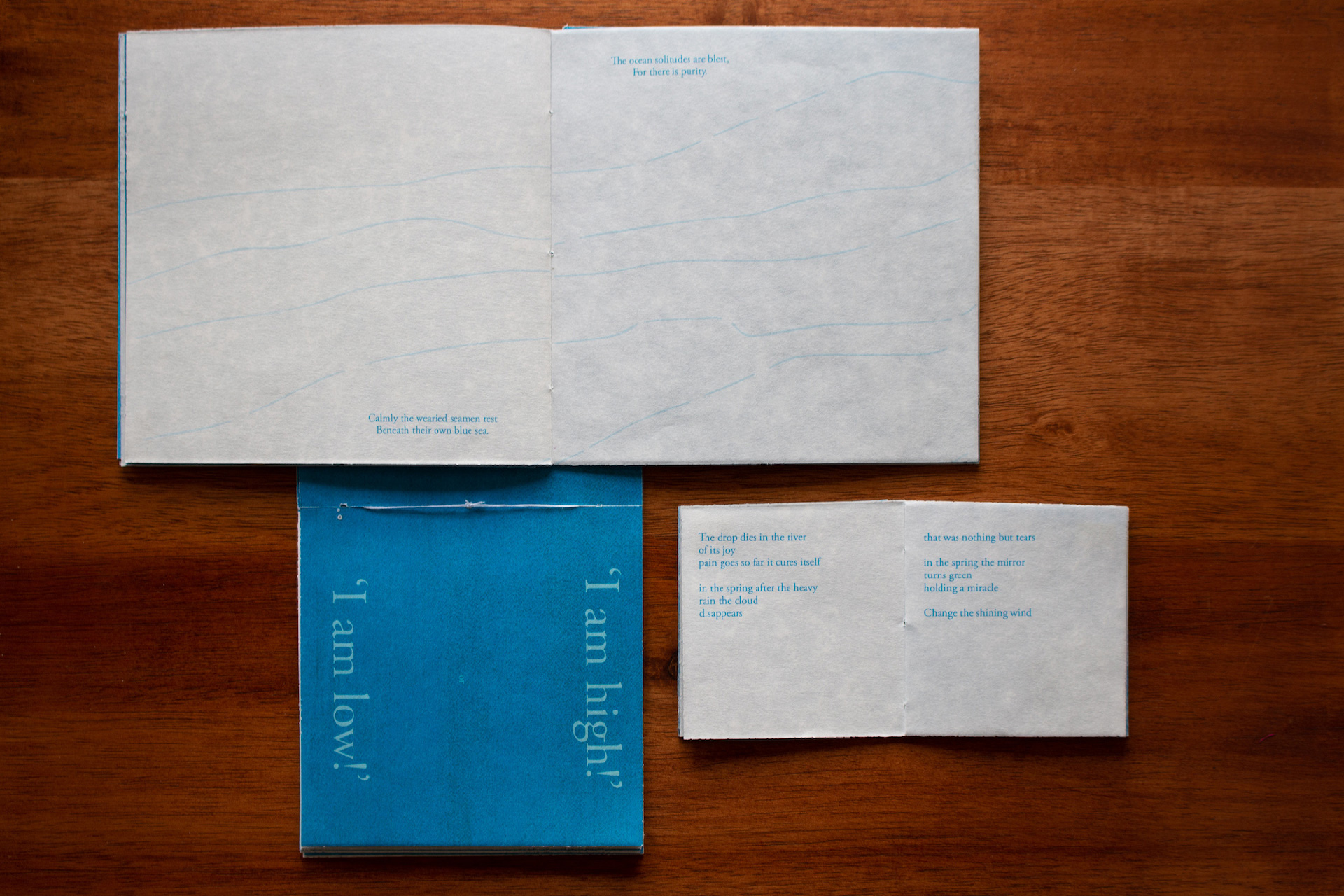
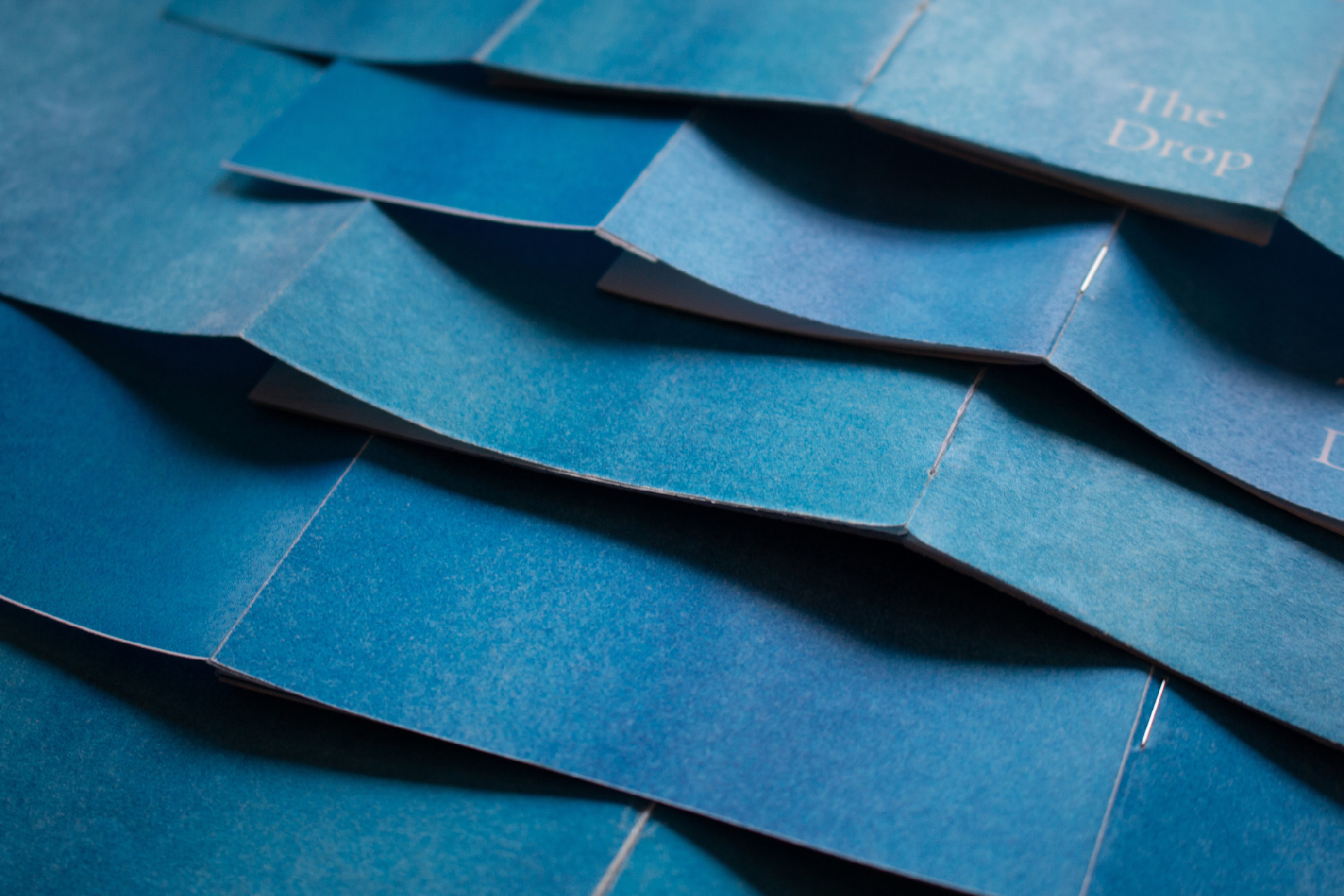
My personal favourite 'easter egg' is that the flaps on the cover of each book fold open, and when laid out, the books themselves turn into waves.
Storyboarding
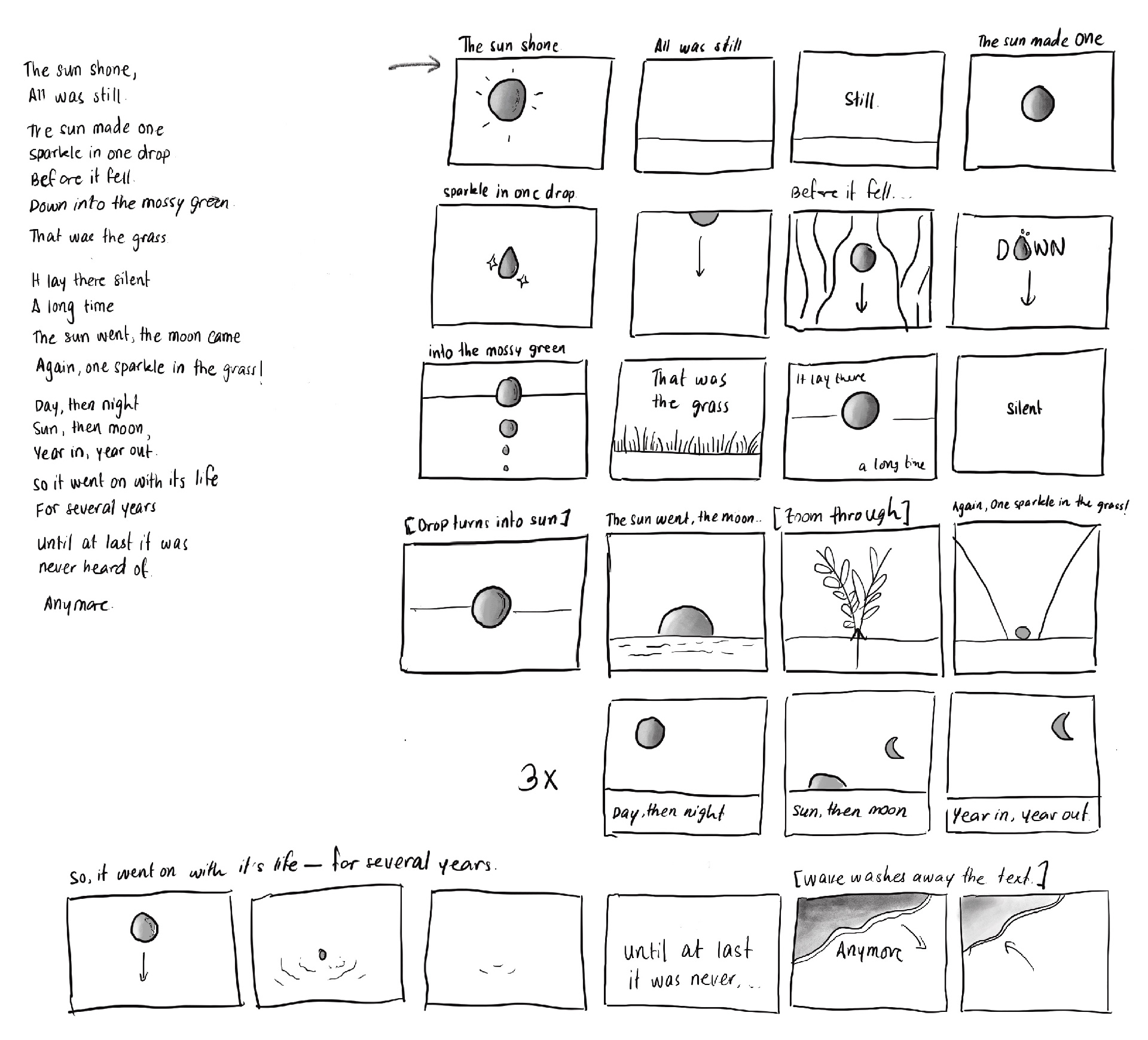
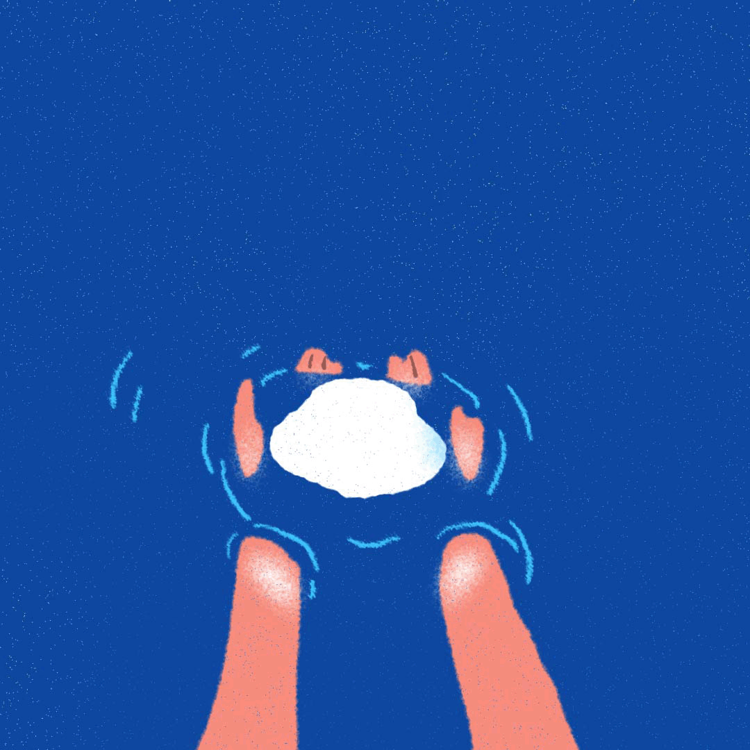
The next step of my project was converting one of the poems into a motion "teaser", to test how the books would look in another format. I started by picking the most "visual" of the poems, and converting it into thumbnails
Style-frames
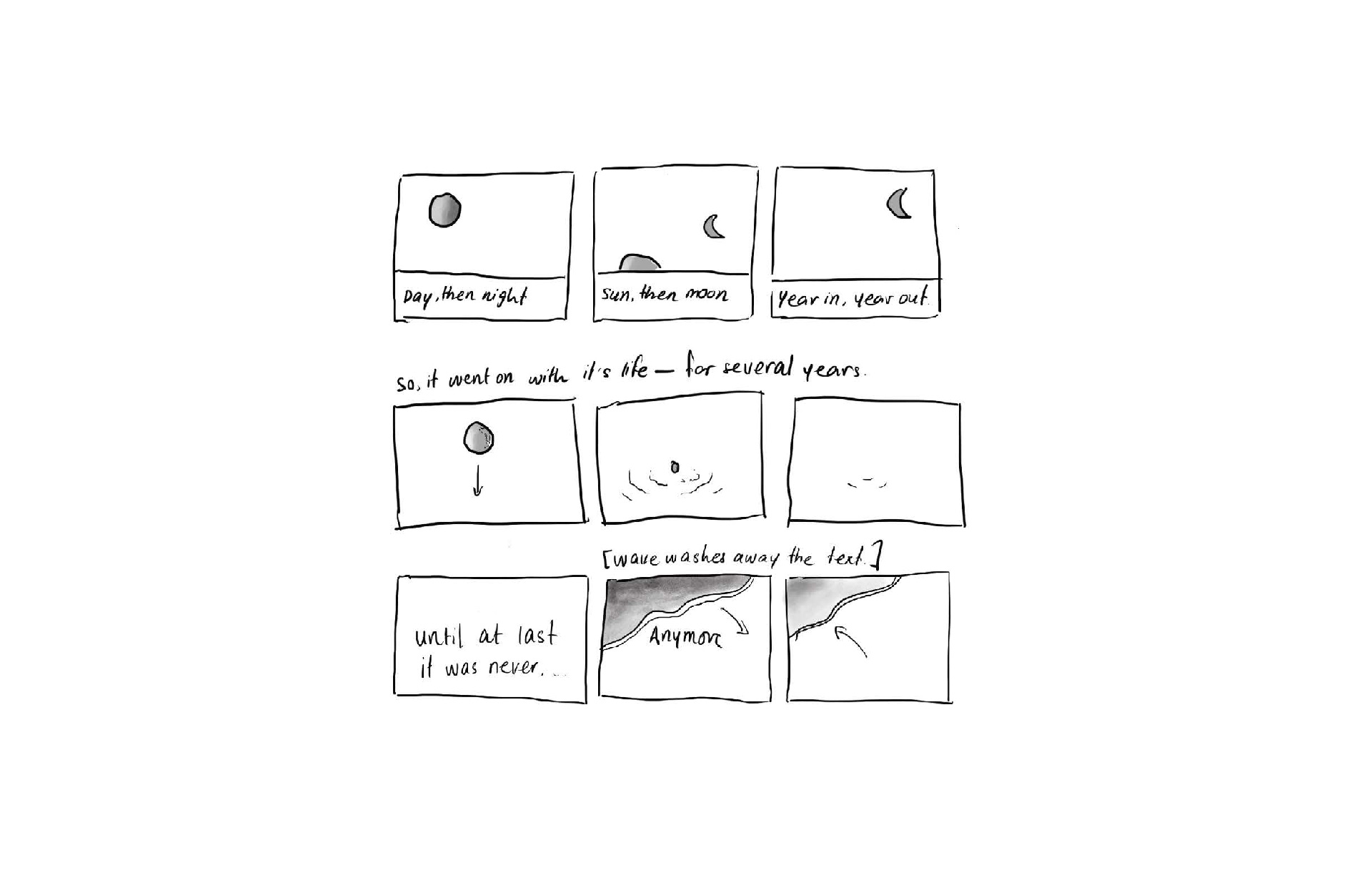
I then picked out a small chunk of the thumbnails and designed some style frames –– these served as a guide for the look and feel for the illustrations, as well as the rest of the animation.
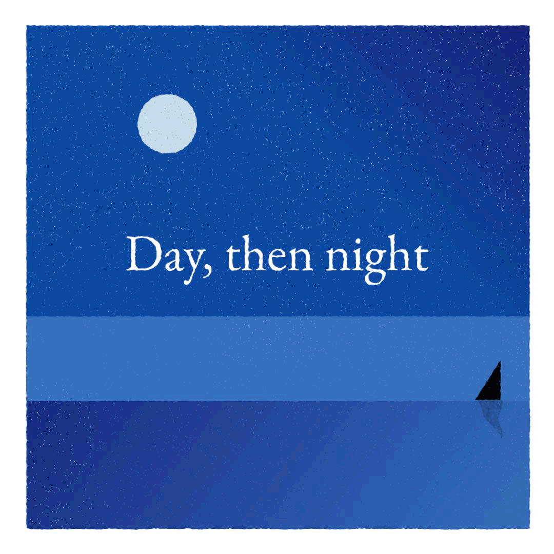
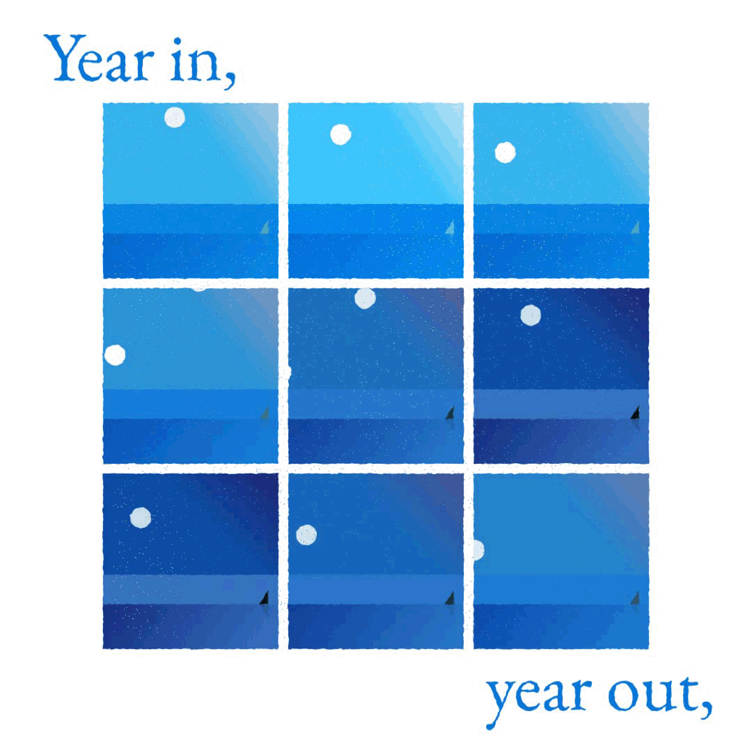
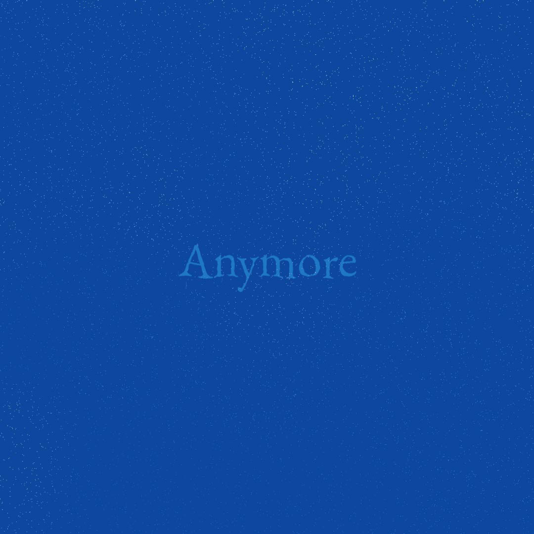
Here's how the final "teaser" turned out:
The books gradually decrease in size, like the water they represent. The Drop is gentle and fragile, almost as if you're trying to hold a drop of water, while The Ocean has large empty spaces next to the small text, as if you're surrounded by a vast body of water.
I wanted to focus on simplicity (with a hint of surprise now and then) and bring a calm, serene and meditative feel to each book. In the process, I not only learnt to use typography to reflect emotions but also learnt how to saddle-stitch booklets!
I wanted to focus on simplicity (with a hint of surprise now and then) and bring a calm, serene and meditative feel to each book. In the process, I not only learnt to use typography to reflect emotions but also learnt how to saddle-stitch booklets!
While converting the poem into an animated piece, I wanted to retain the original qualities of the book but also bring in different shades of blue, and simple illustrations to make it more captivating and fit the different medium. In hindsight, I could have slowed down some of the motion, and found a calmer, gentler audio piece to go with it. Overall, my aim was to create a gentle space for the reader/viewer to get absorbed into to feel the depth of the poems.