Malavika
Divide By Zero
![]()
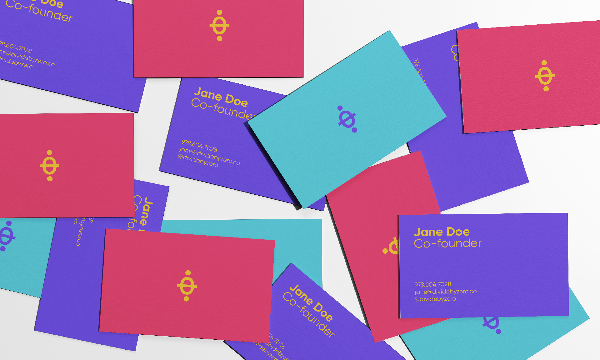
Print Design
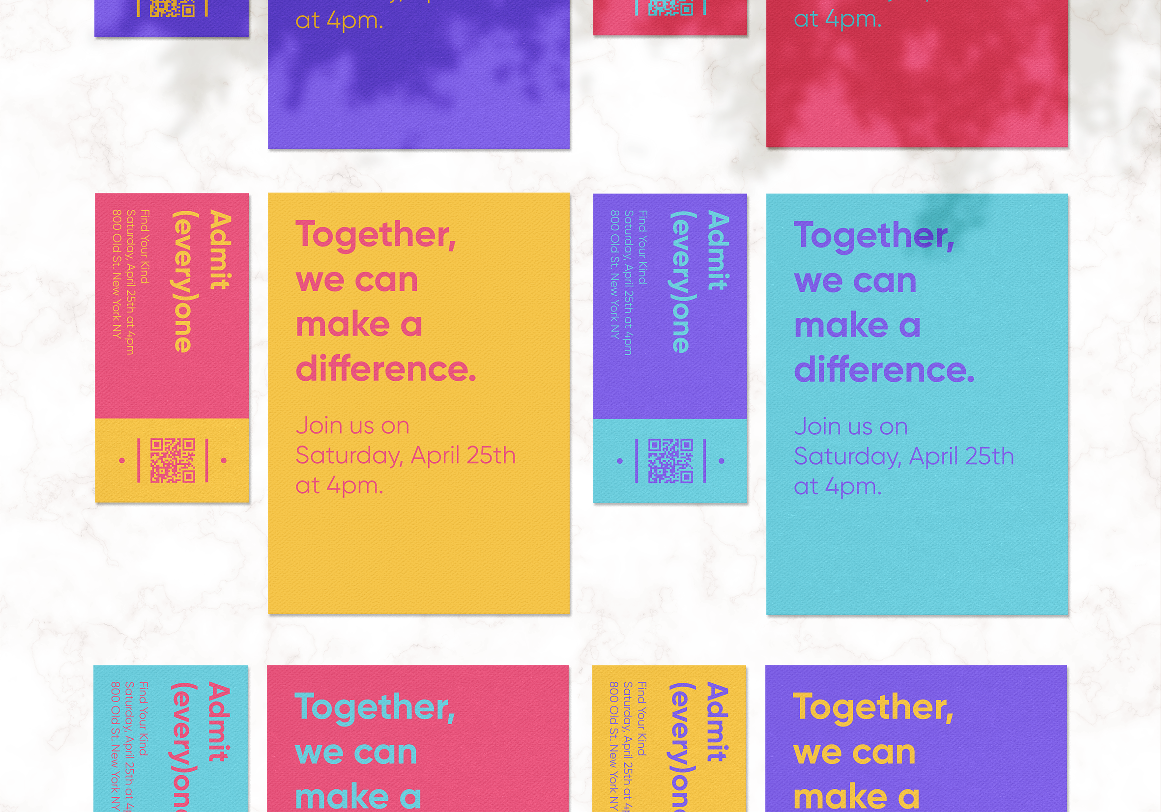
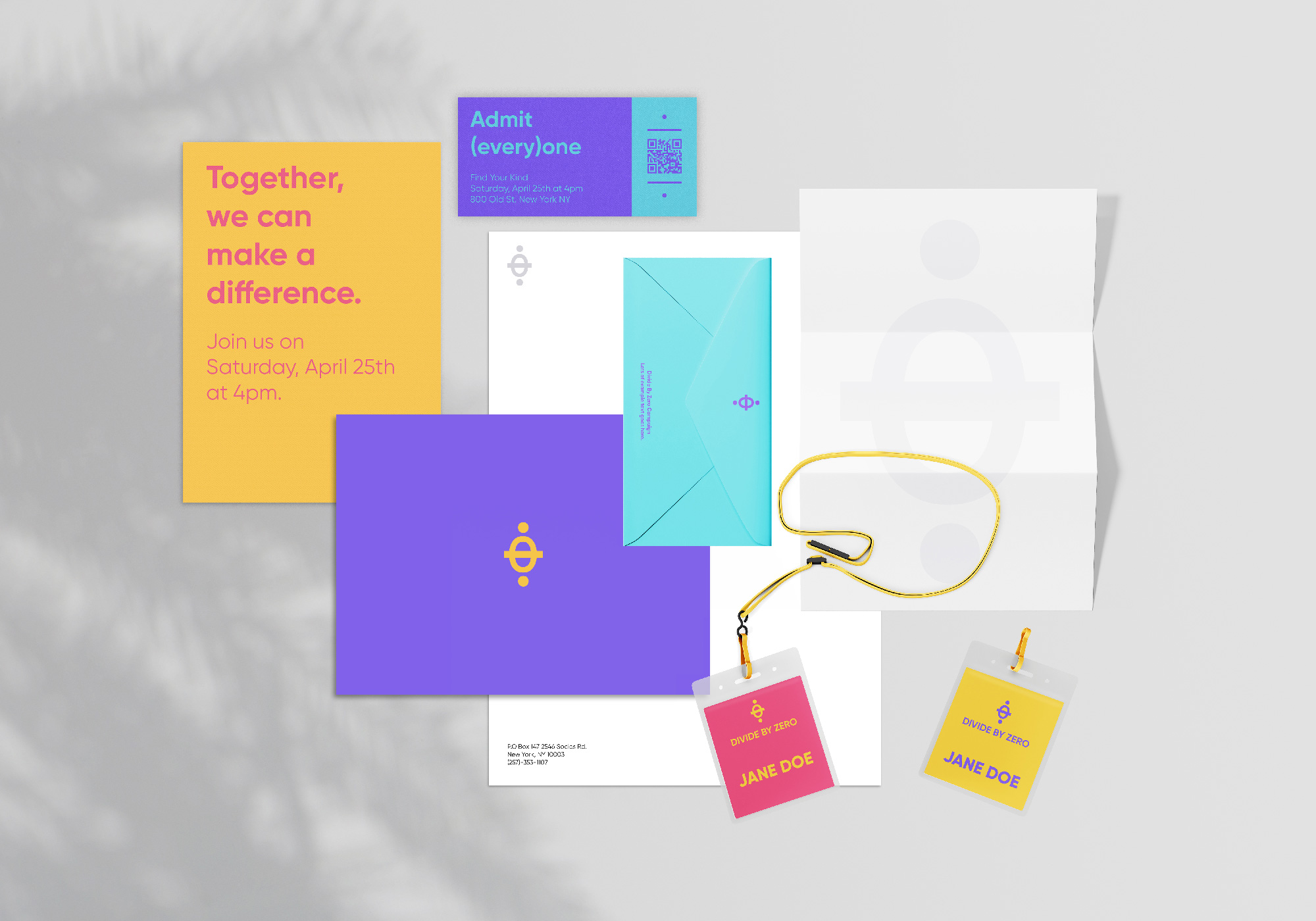
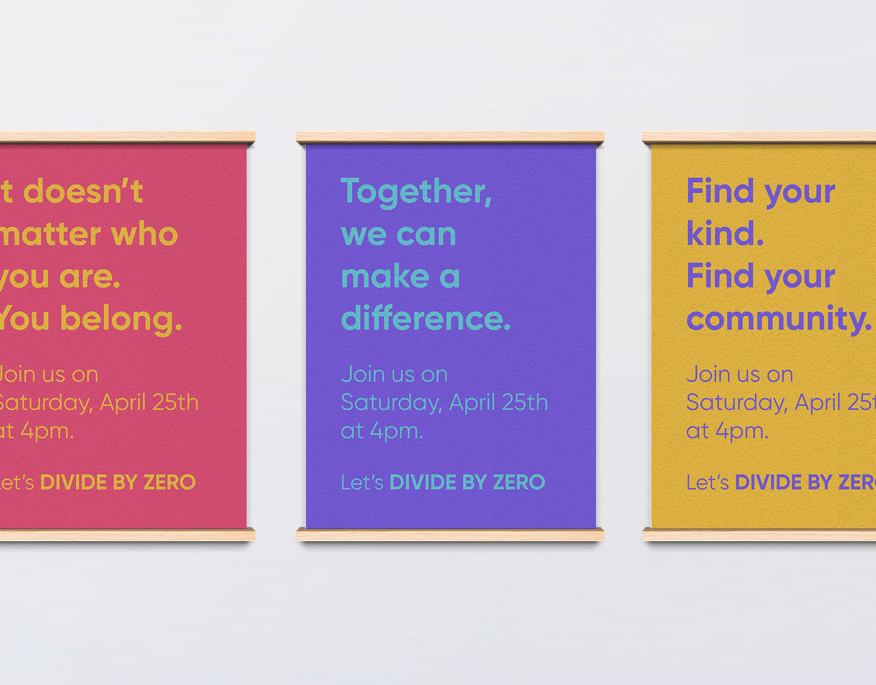
While designing the brand system, I wanted to pay attention to the use of language, as well as the visuals. It wasn't exclusively about how the brand looked but also about how the brand sounded. The identity has a powerful, bold but cheeky voice, with a strong focus on inclusivity –– this can be seen, for example, in the event tickets that say "Admit (every)one" or the clear mission statements on posters and invites.
Motion Design
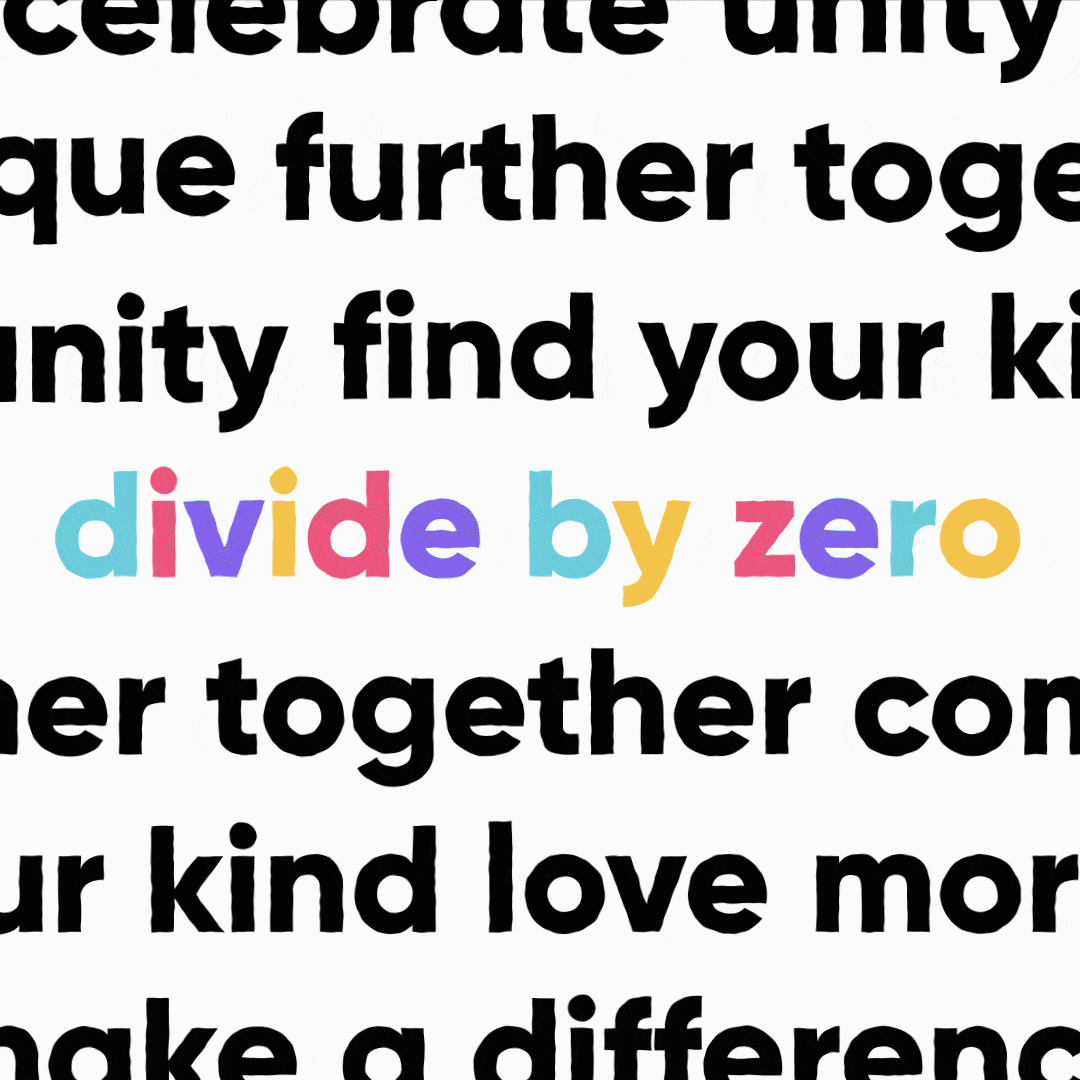
Visualizing the logo and the brand's voice in motion.
![]()
Web Design


The challenge was to build a cohesive and compelling visual brand story with a fresh and authentic voice from scratch. The bold and bright color palette contrasts the minimal type treatment to create a playful and flexible identity system. Led by my passion for simplicity and bright ideas, the identity is brought to life in print and online, with an experience full of thoughtful details and powerful character.