Malavika
Visualizing Pain
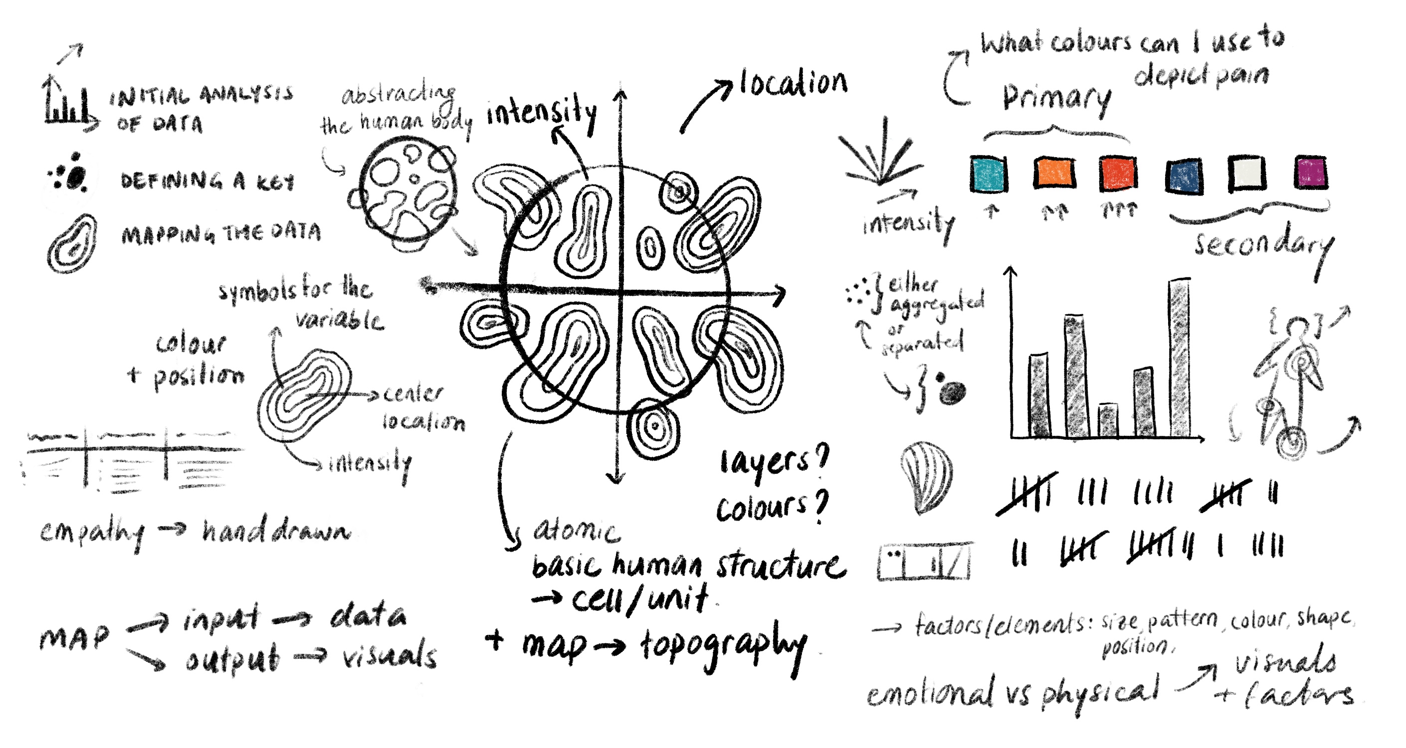
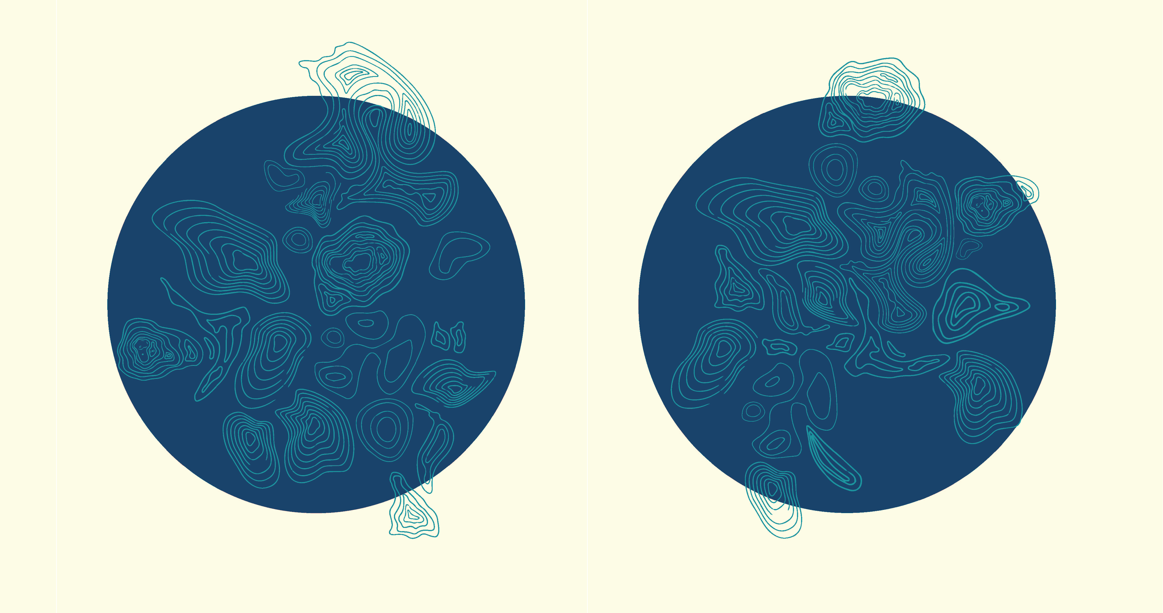
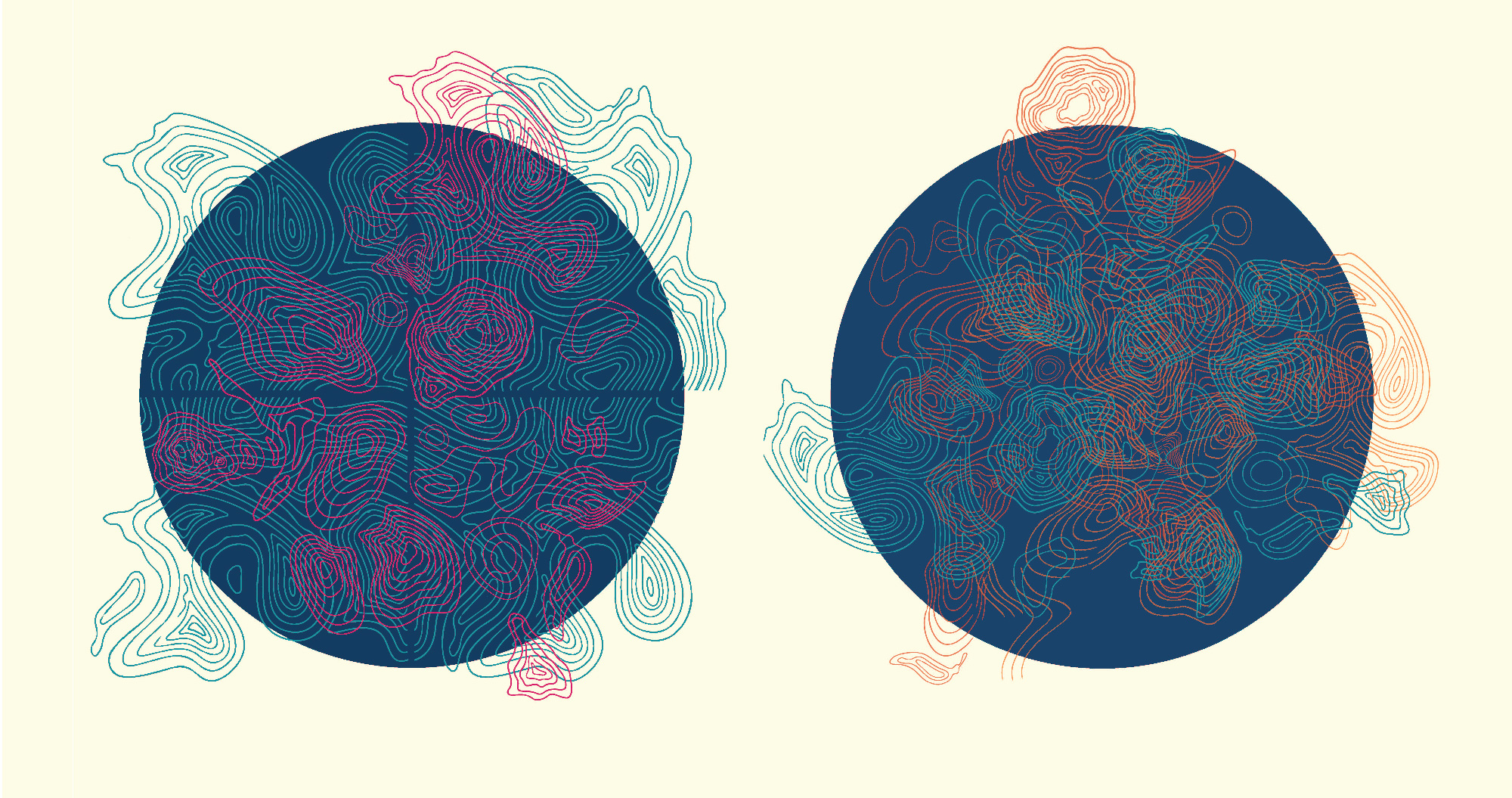
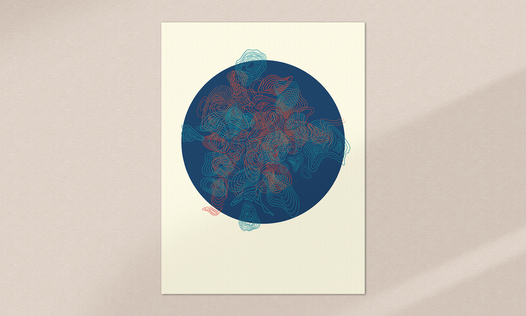
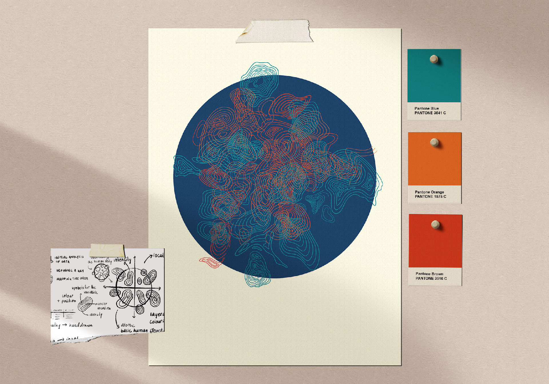
The piece visually consolidates and describes pain related data of 20+ people–– where, how and when they feel pain in their bodies. By correlating different factors and data variables with visuals such as number of rings for intensity or colour for the mind/body connection, I charted out a graph that looked like an abstract art piece inspired by topography –– since it was after all, an attempt to "map" pain. The goal was to use a rational approach to describe something largely emotional and irrational at times, and to use a more scientific approach to aid the creative process and give the data a voice.

Ultimately, I wanted to use individual experiences to describe a larger concept and create a collaborative art piece that invokes shared empathy and emotion. I aimed to use data as a tool to better understand human nature, and data visualization as a medium to narrate what I discovered.
The result turned out to be a little chaotic and overwhelming –– something I wasn’t prepared for, but later realized expressed the data quite accurately. Although the piece isn’t by any means a scientific representation of data, I still hope it paints an accurate sensorial picture of these personal journeys.