Malavika
Hauser & Wirth
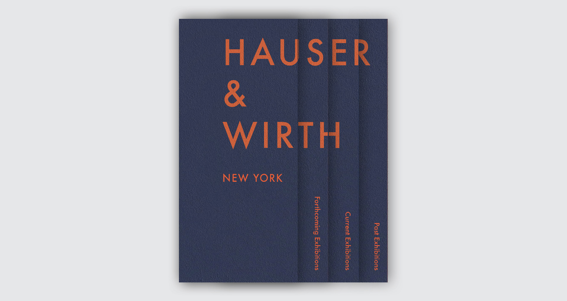
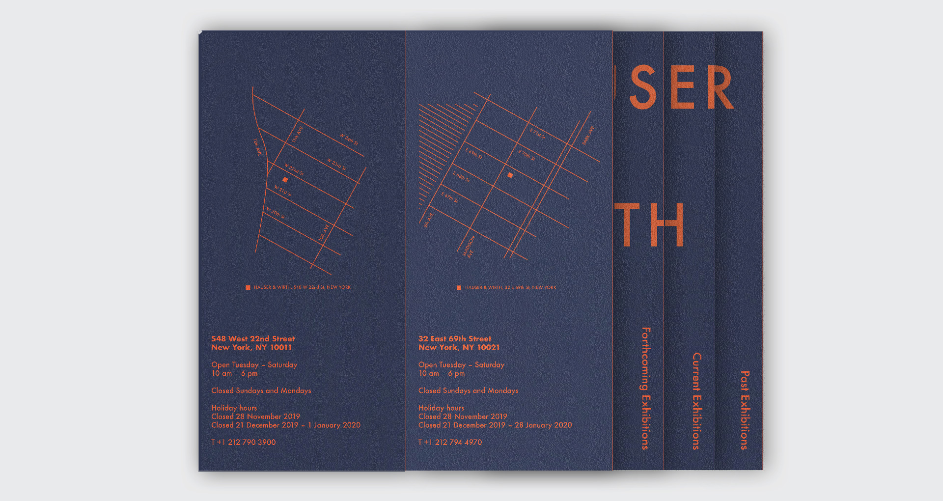
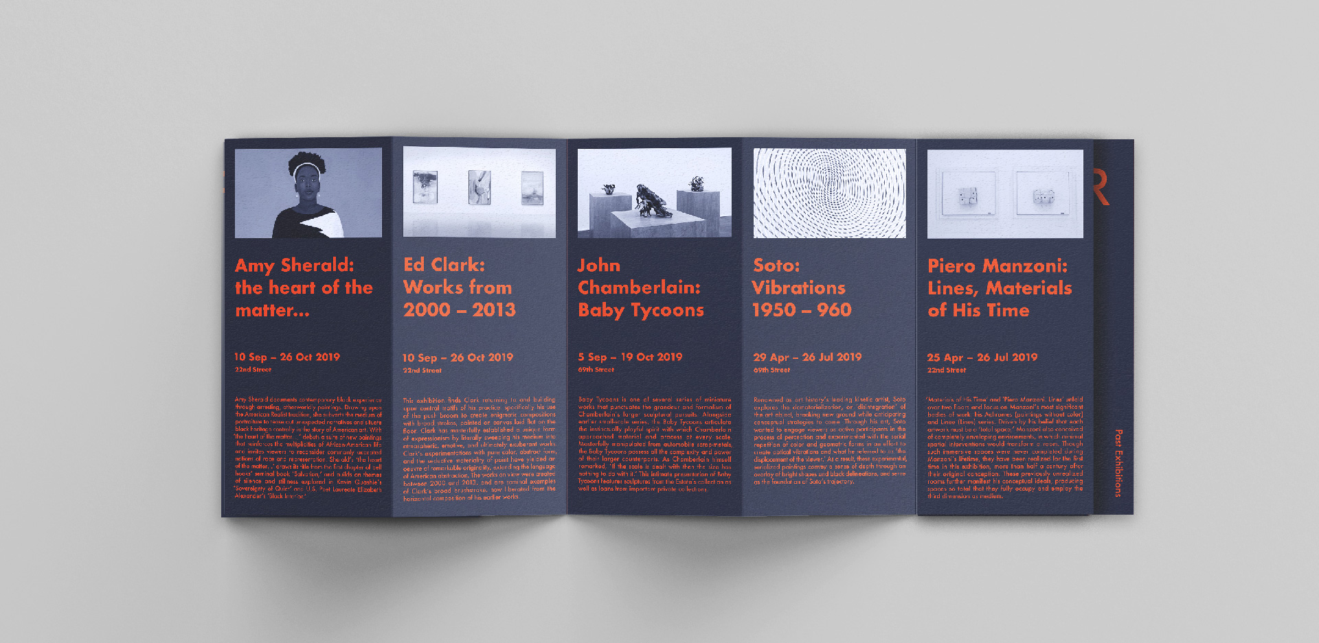
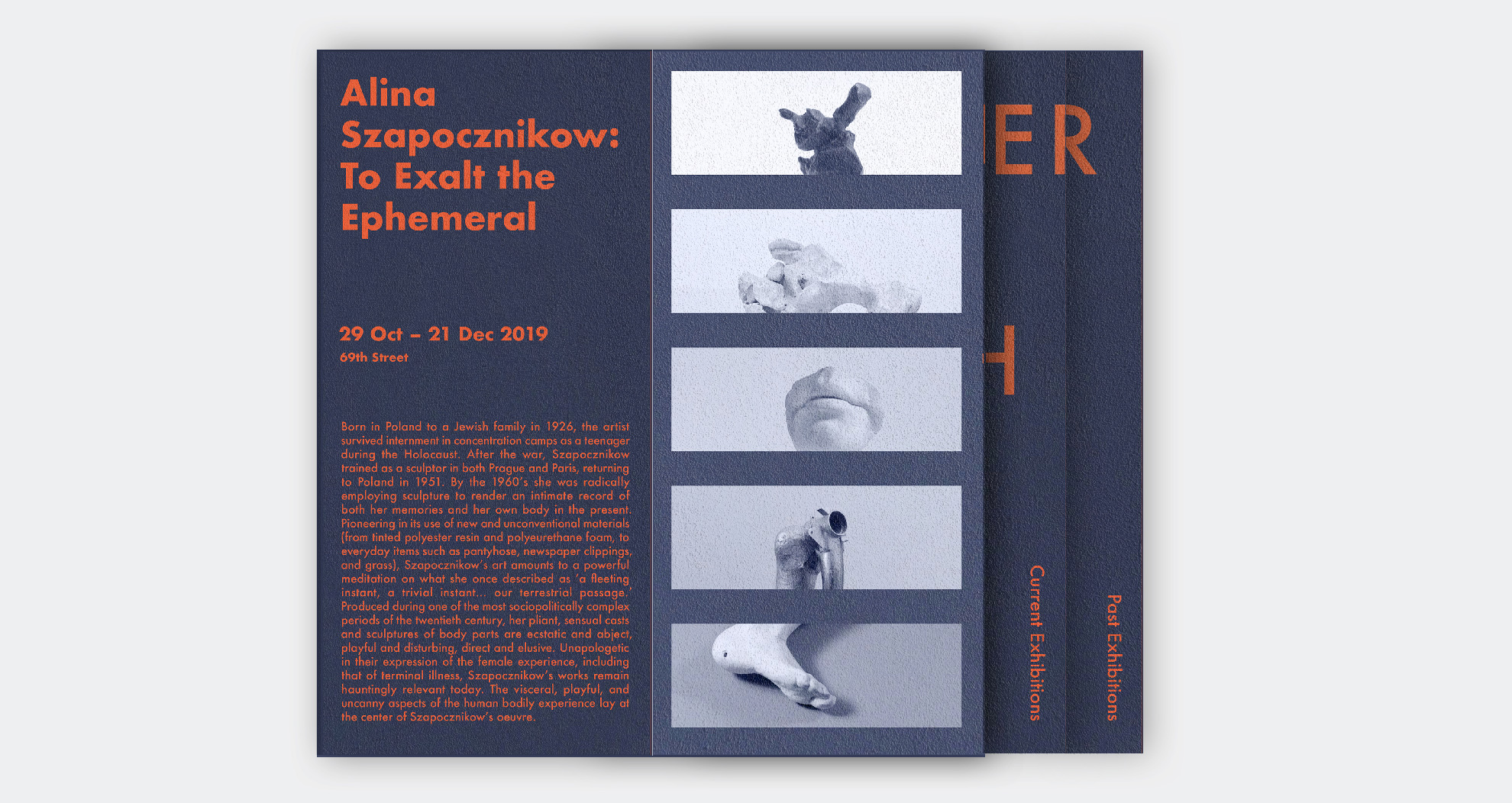
I decided to treat this not as a book, but a product –– this way, I not only had to pay attention to the typography and layout of the book, but also had to design the user's interaction with the book. The physical format and unconventional folding plays a large part in the reading experience and design of the book.
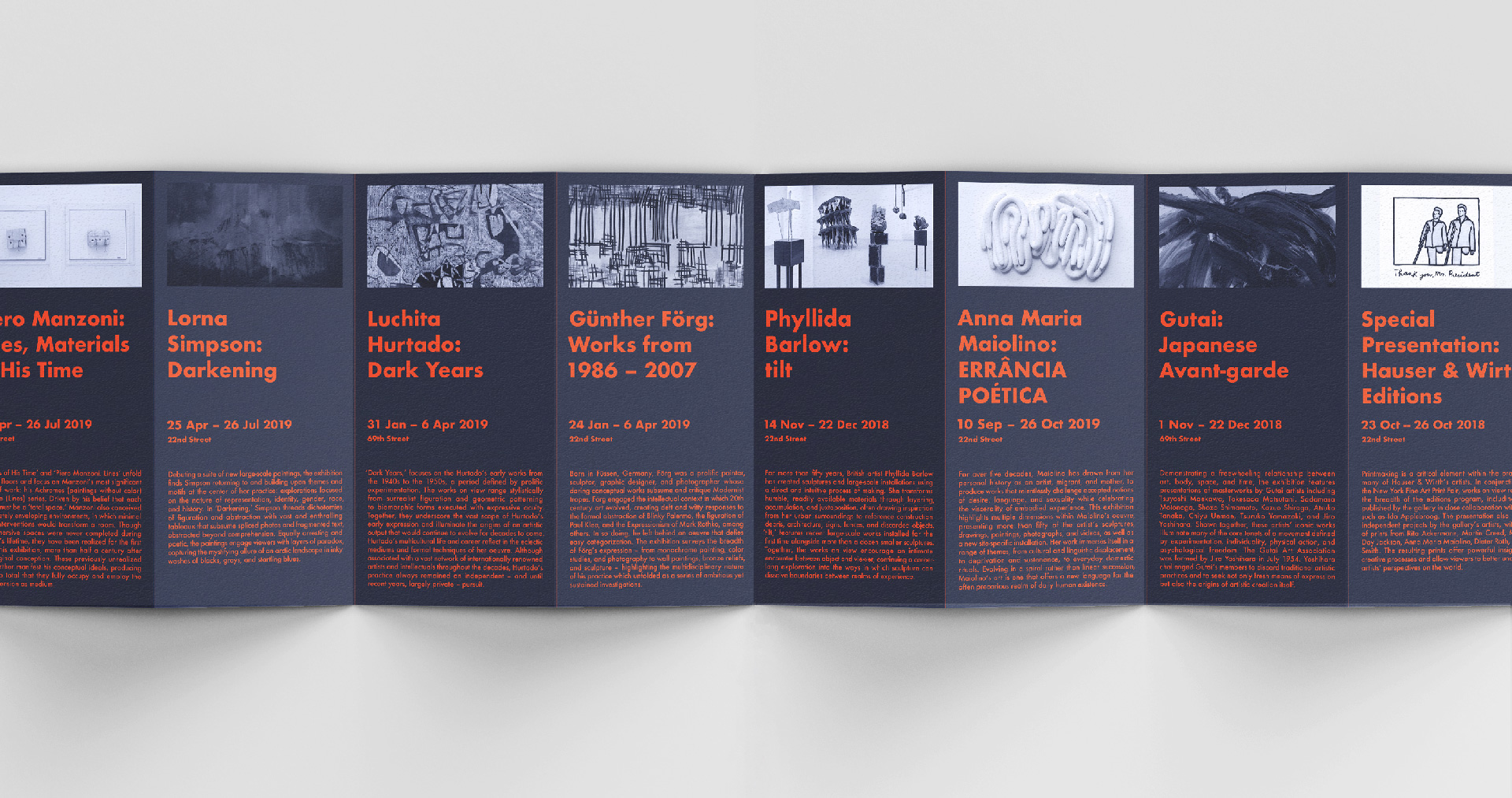
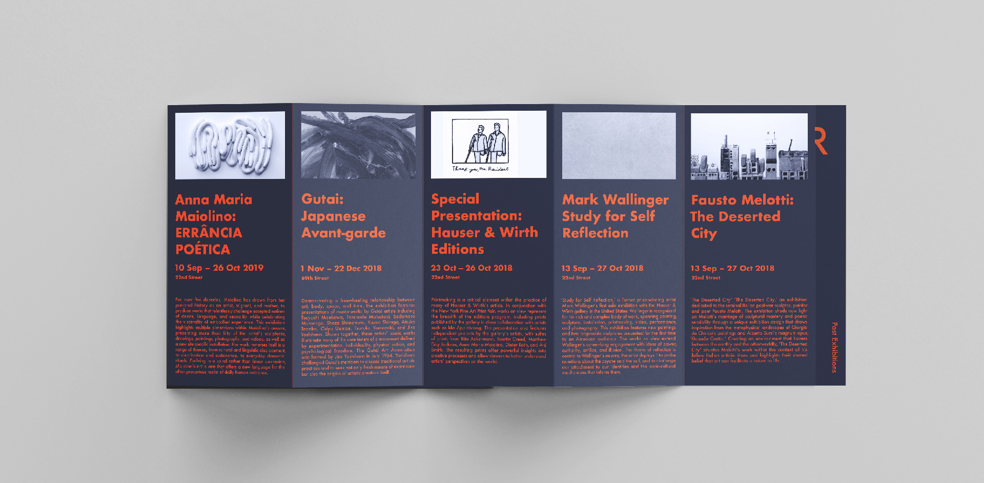
The main goal of the project was to define paragraph and character styles to apply throughout the designs. Different pieces of information (artist name, show title, description, days on view, etc) had to be signified exclusively through a type hierarchy.